CommandOps — SaaS Operations Dashboard Template
Welcome, and thank you for purchasing CommandOps. This documentation covers everything you need to install, run, customize, and extend the template — from your first npm install to rebranding colors, adding new pages, and swapping in your own backend.
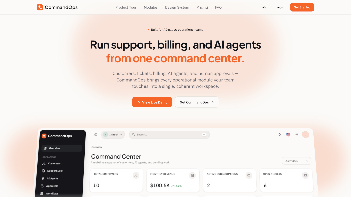
CommandOps is a premium, fully-coded Next.js 16 + React 19 + TypeScript admin dashboard template. It is not a generic CRM or e-commerce back-office clone — it is purpose-built for a specific, fast-growing category of company: SaaS businesses that run part of their operations through AI agents and need a human in the loop for anything risky.
Where most admin templates stop at "customers, tickets, invoices, charts," CommandOps adds the operational layer that AI-native SaaS teams actually need day to day: every AI agent's success rate, cost, and risk exposure tracked like a real ops metric; a human approval queue so a refund, a risky reply, or a plan downgrade an agent drafts never reaches a customer without sign-off; usage metering and overage billing tied directly back to the customer who generated it; and a full audit trail that treats "agent suggested a refund" as a first-class logged event, same as "admin changed a role."
107
Routes
15
Modules
8
Dashboards
115
Components
Who this is for: SaaS founders and product teams who need an internal ops console; agencies building admin panels for SaaS clients; and developers building AI-agent-powered products who need a UI vocabulary for agent performance, cost, risk, and human oversight.
Features Overview
CommandOps deliberately balances two things: a foundation of common, must-have SaaS admin modules, and a set of signature modules built around AI agent oversight that you won't find in a generic admin template.
~70%
Foundation modules
Dashboards, Customers, Support Desk, Billing, Team & Roles, Analytics, Security, Audit Logs, Settings, and a full Auth flow — everything a SaaS admin panel is expected to have.
~30%
Signature modules
AI Agents, Human Approval Queue, AI Cost & Risk monitoring, Workflow Automation, Usage Metering, and a Knowledge Base with AI-source scoring — the part that makes this template genuinely different.
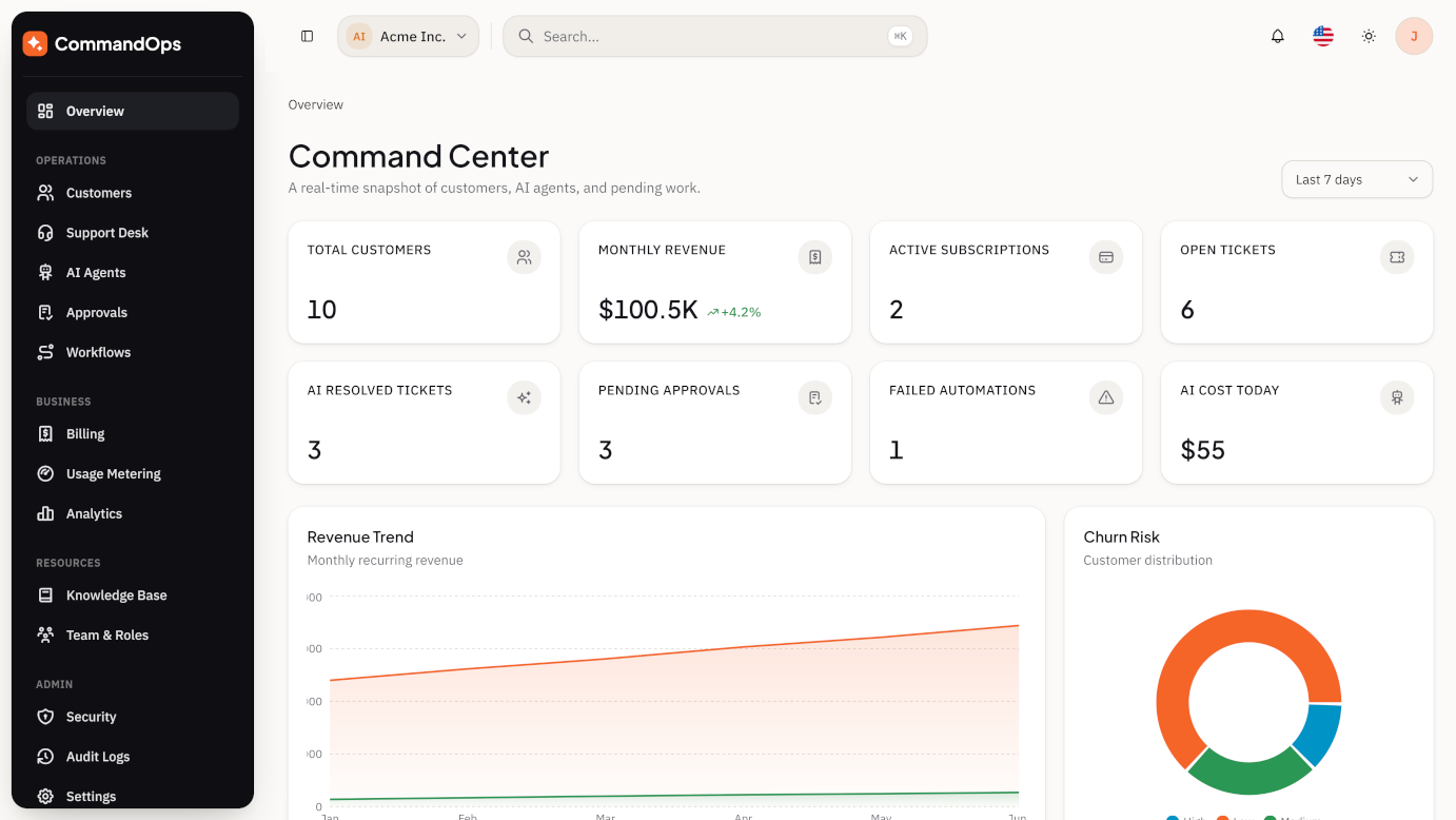
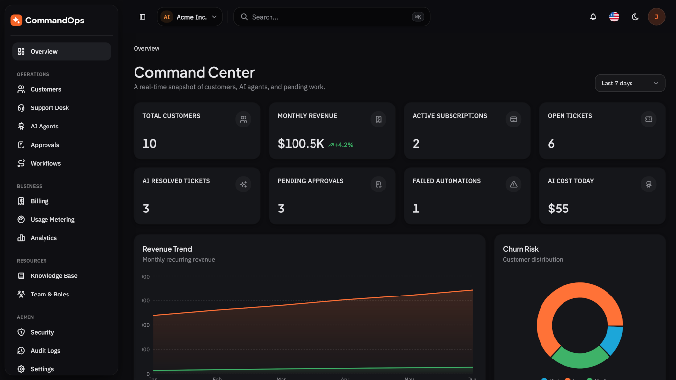
Dashboards (8 variants)
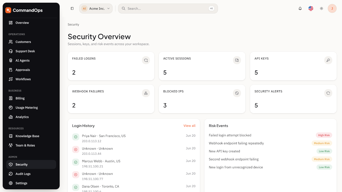
Command Center · SaaS Overview · Support Operations · Billing Operations · AI Agent Operations · Workflow Operations · Security Overview · Analytics Overview — each with its own KPI cards, charts, and widgets tailored to that operational view.
Customers / Tenants
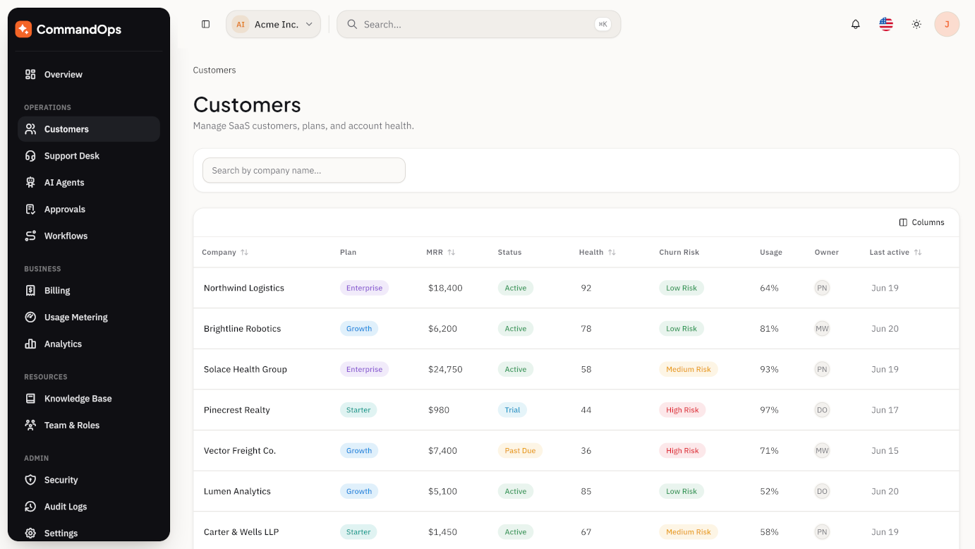
Customer list with health score, churn risk, MRR, and usage %; a tabbed detail page (Overview, Users, Billing, Usage, Support, AI Activity, Timeline, Files, Audit, Notes); AI-generated customer summaries and suggested next actions.
Support Desk
Ticket inbox with priority/status/assignee filters, SLA countdowns, an AI-suggested-reply panel with confidence scoring, internal notes, escalation flow, canned replies, and a support analytics view.
AI Agents Signature
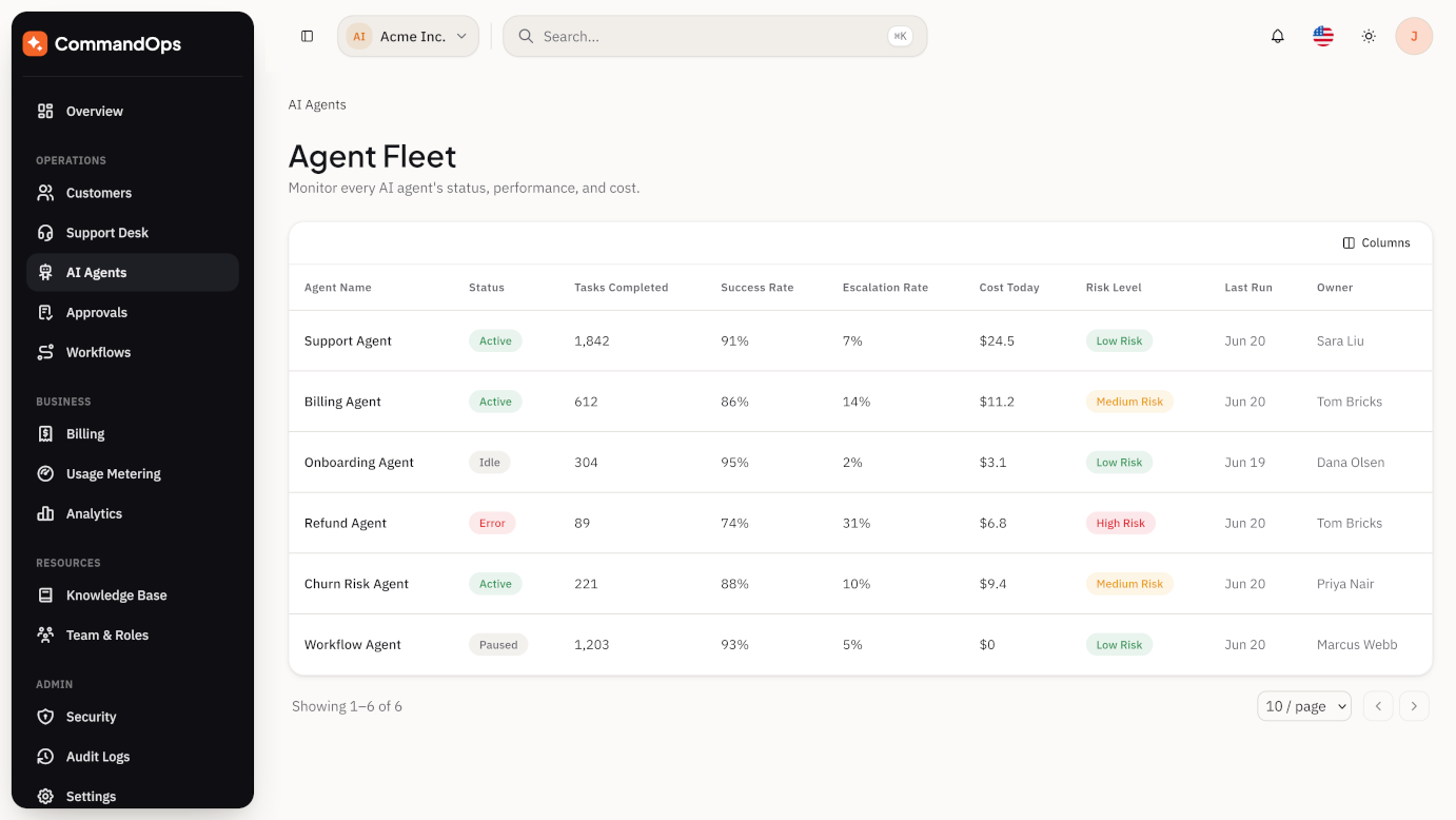
A roster of named agents (Support, Billing, Onboarding, Refund, Churn Risk, Knowledge Base) each with performance, cost, conversation history, prompt versions, knowledge sources, and failure logs.
Human Approval Queue Signature
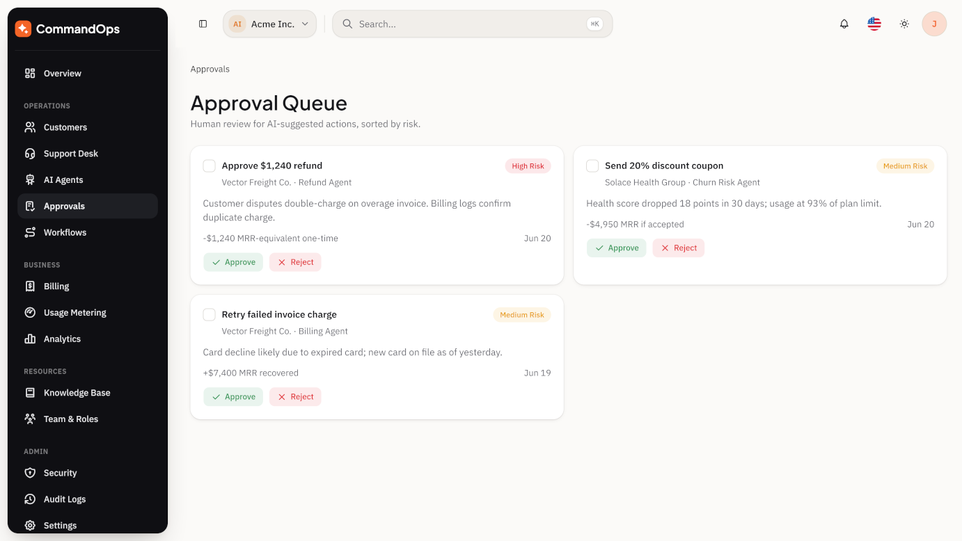
The control layer for AI autonomy: every risky agent-suggested action (refund, discount, plan downgrade, risky reply, data deletion) lands here with its risk level, AI reasoning, estimated impact, and an approve / reject / modify / escalate flow.
Workflow Automation Signature
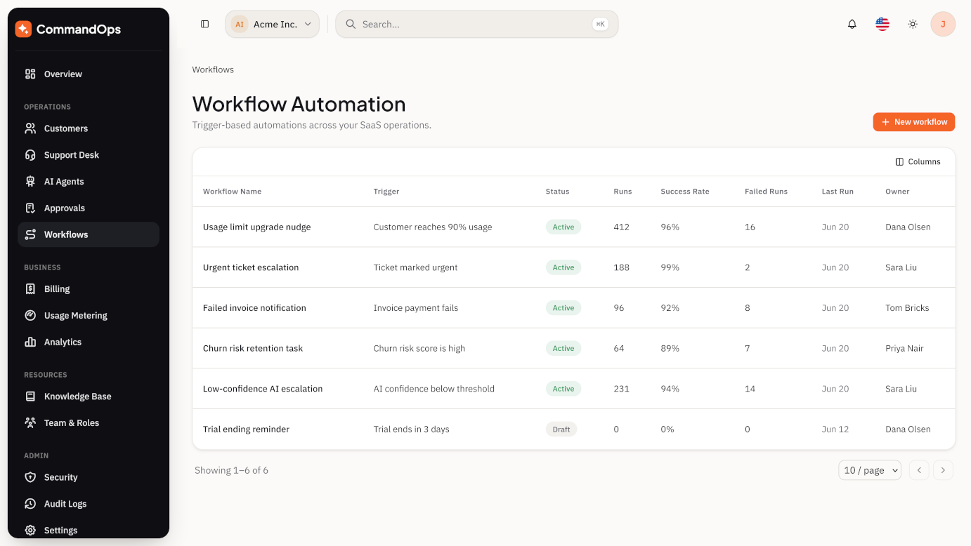
A visual builder (trigger → condition → action → delay → approval → notification → AI agent task → webhook) with a template gallery, run history, and failed-run diagnostics.
Billing
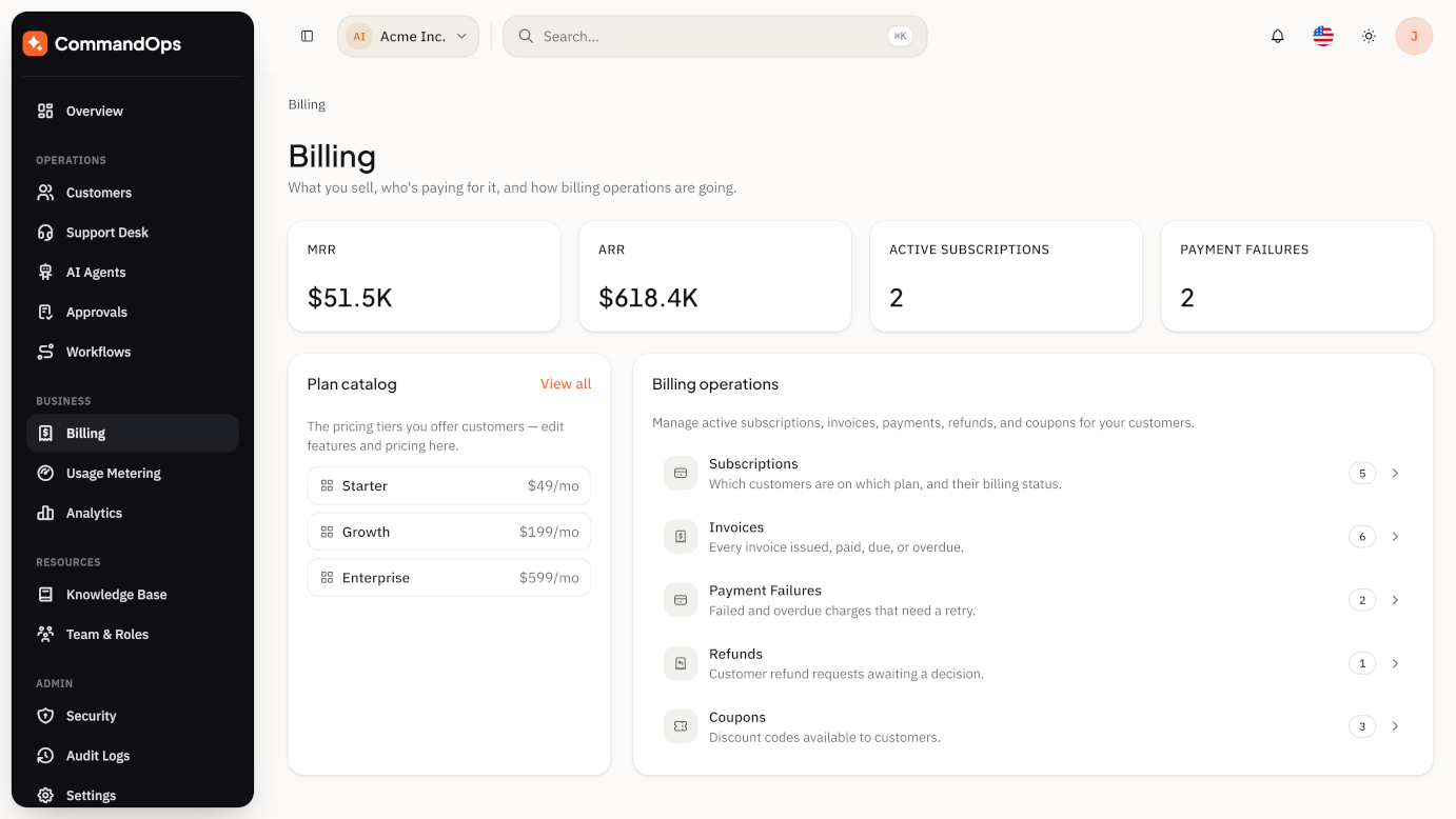
Plans, subscriptions, invoices, payments, refunds, coupons, and a refund approval queue — with AI cost linked directly into customer billing and usage-based overage charges.
Usage Metering
API calls, AI tokens, storage, seats, workflow runs, and webhook deliveries tracked per customer against plan limits, with overage warnings and projected billing.
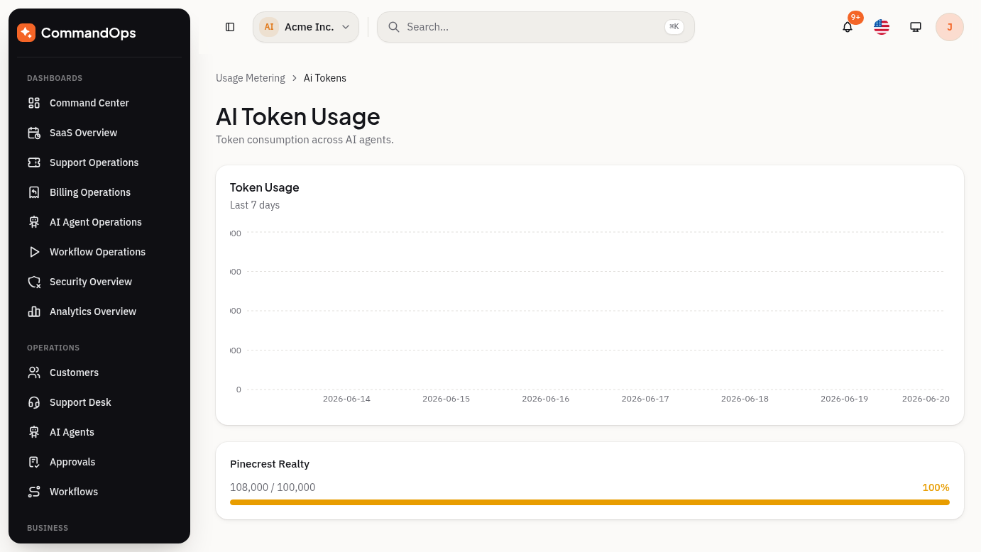
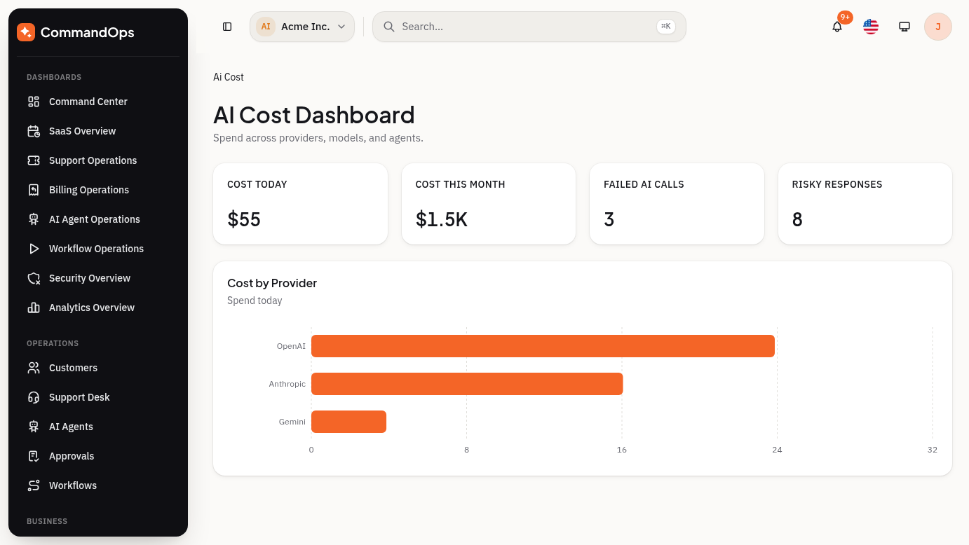
AI Cost & Risk Signature
Cost-today/cost-this-month by provider and by agent, token usage, failed AI calls, and a risk table logging every flagged response with severity, reviewer, and action taken.
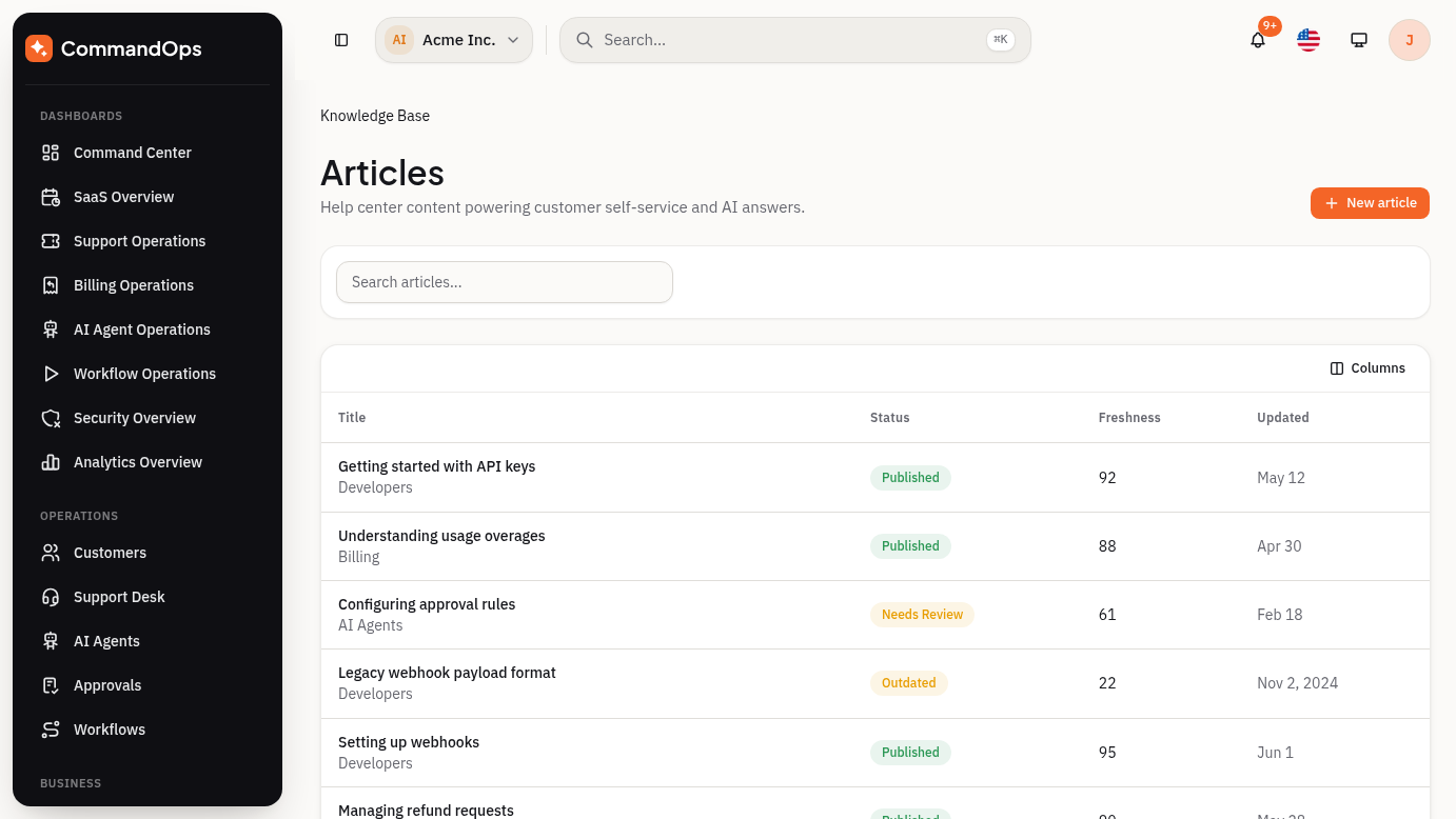
Knowledge Base
Article list/editor with draft → review → published states, category management, AI-training-source quality scoring, and search analytics.
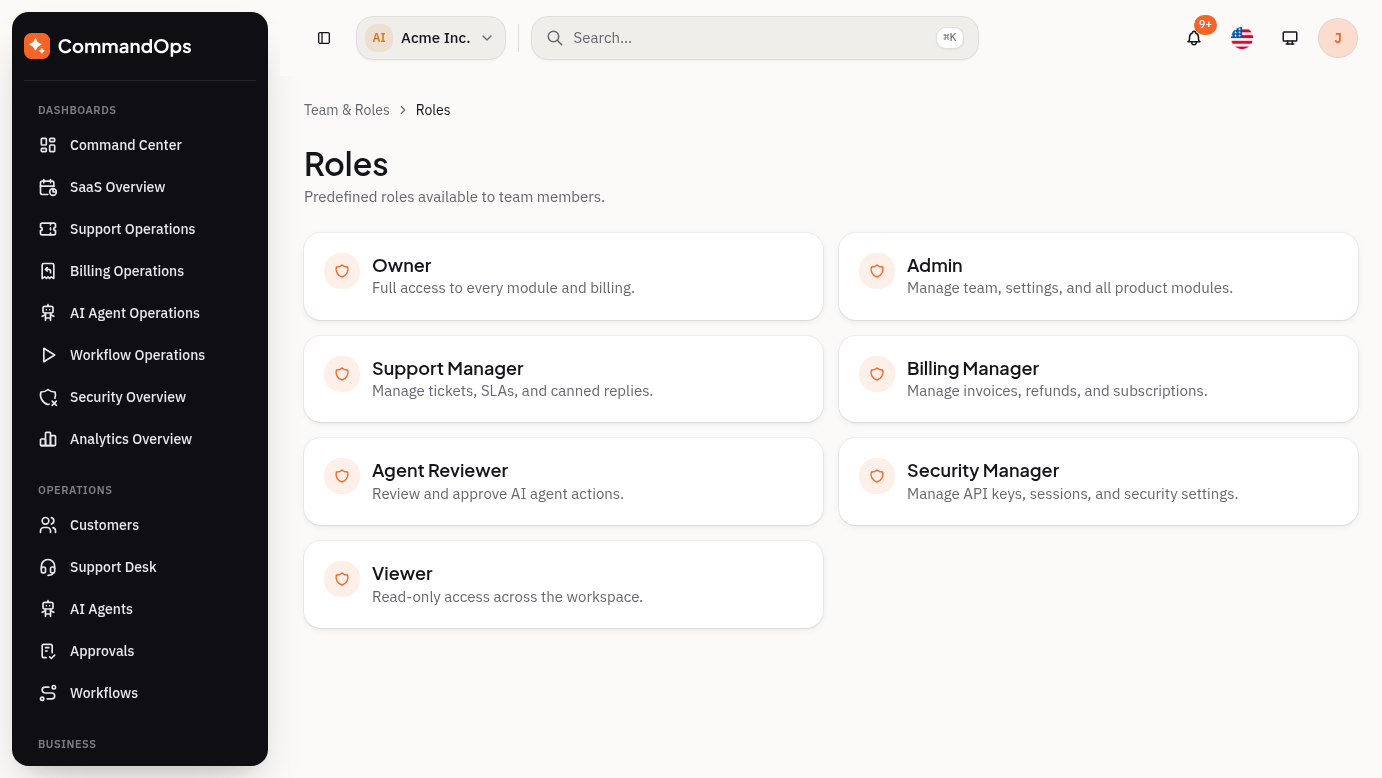
Team & Roles, Security, Audit Logs
Role-based permission matrix, invitations and access requests; sessions, API keys, webhooks, 2FA, login history, and blocked IPs; a unified filterable audit timeline across users, agents, billing, approvals, and security events.
Analytics
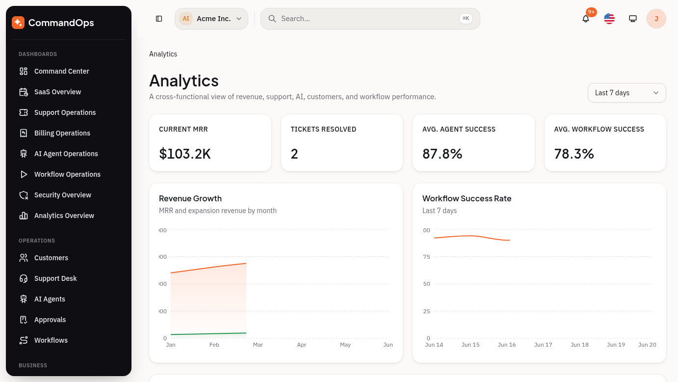
Cross-module reporting — revenue, customer, support, AI, and workflow analytics views with trend charts and exportable summaries.
Settings
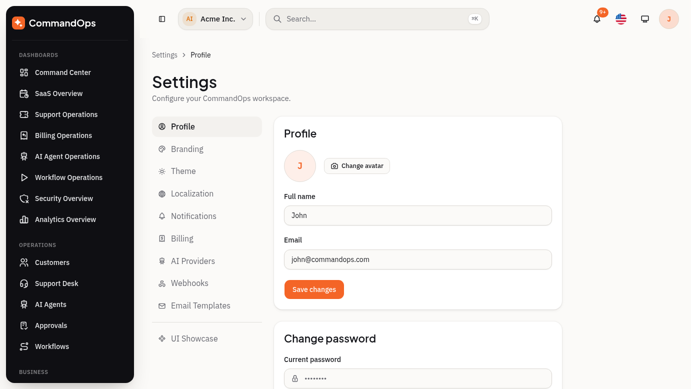
Profile, branding, theme, notifications, billing, localization, email templates, webhooks, and AI provider configuration in one settings workspace.
Authentication
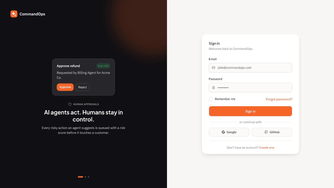
Login, Register, Forgot/Reset Password, Email Verification, Two-Factor Authentication, Lock Screen — fully mocked so the demo runs with zero backend setup.
Requirements
CommandOps ships as source code — there is no purchase code or license activation step to run it locally.
| Requirement | Version / Notes |
|---|---|
| Node.js | 20.x or later (LTS recommended) |
| Package manager | npm (a package-lock.json is included). Yarn or pnpm will work but create their own lockfile. |
| Database | None required — the template runs entirely on mock data. |
| Environment variables | None required to run the demo. |
| Code editor | Any editor works; VS Code with the Tailwind CSS IntelliSense and ESLint extensions is recommended. |
Installation
Unzip the package and locate the Next.js project (inside main-files/ if you downloaded the full ThemeForest package). Then, from that project's root:
npm installThis installs every dependency listed in package.json — Next.js, React, Tailwind CSS, Radix UI, TanStack Query/Table, React Hook Form, Zod, Zustand, Recharts, and Tabler Icons.
Tip: Sign in with any email address and any password of 8 or more characters — authentication is fully mocked, no backend or account is required to explore the app.
Running the Project
Start the development server with Turbopack:
npm run dev
Visit http://localhost:3000 for the public marketing page, or go directly to /dashboard — every route in the template is directly browsable without signing in first.
If port 3000 is already in use, Next.js automatically picks the next free port and prints the URL in your terminal.
Build Commands
| Script | Purpose |
|---|---|
npm run dev | Start the Turbopack dev server with hot reload |
npm run build | Production build — runs a full TypeScript check before emitting output |
npm run build:static | Static export to out/ for hosts without a Node runtime |
npm run start | Serve the production build from npm run build |
npm run lint | ESLint (Next.js core-web-vitals + TypeScript rules) |
For a standard Node hosting environment (Vercel, a VPS, Docker):
npm run build
npm run startFor a static host (no Node runtime — e.g. an S3 bucket, GitHub Pages, or a plain Apache/Nginx server):
npm run build:static
# deploy the generated out/ folderEnvironment Variables
The demo you unzipped needs zero environment variables — it runs entirely on mock data in data/*.ts. The table below is a reference for when you connect a real backend, auth provider, or AI provider (see Connecting a Real Backend) — add a .env.local file with whichever of these your integration actually needs.
| Variable | Used for | Example |
|---|---|---|
| NEXT_PUBLIC_API_BASE_URL | Base URL for your real backend once lib/api/*.ts is wired to live HTTP calls instead of mock data | https://api.yourapp.com |
| API_AUTH_SECRET | Server-side session/JWT signing secret, if you replace the mocked login flow with real authentication | a long random string |
| NEXT_PUBLIC_AI_PROVIDER | Which AI provider the Settings → AI Providers screen talks to | openai, anthropic |
| OPENAI_API_KEY / ANTHROPIC_API_KEY | Server-side key for your chosen AI provider — keep it server-only, never expose it with a NEXT_PUBLIC_ prefix | — |
| NEXT_STATIC_EXPORT | Already used by npm run build:static — not a backend variable, listed here for completeness | 1 |
Names are suggestions matching the codebase's existing conventions — rename them to fit your actual backend/provider once you're past the mock-data stage.
Connecting a Real Backend
CommandOps is built in three layers specifically so swapping mock data for a real API touches only the middle layer:
data/*.ts        → static mock entities (customers, tickets, agents, invoices...)
lib/api/*.ts     → mock REST-shaped functions with simulated network delay
hooks/queries/*.ts → TanStack Query hooks that call lib/api/*.ts
pages            → consume the hooks, never touch data/ or lib/api/ directly
Because pages only ever import from hooks/queries/*.ts, you can rewrite every function in lib/api/*.ts without touching a single page or component.
Before / after example
A mock function in lib/api/customers.ts today looks roughly like this:
export async function getCustomers() {
await simulateDelay()
return mockCustomers
}Replaced with a real backend call:
export async function getCustomers() {
const res = await fetch(`${process.env.NEXT_PUBLIC_API_BASE_URL}/customers`, {
headers: { Authorization: `Bearer ${getSessionToken()}` },
})
if (!res.ok) throw new Error(`Failed to load customers (${res.status})`)
return res.json()
}Auth headers
Read the token from wherever your real auth system stores it (a cookie, a Zustand store, next-auth's session, etc.) and attach it as an Authorization header, as in the example above. Nothing in hooks/ or the pages needs to change to support this.
Error handling
Throw on a non-2xx response, as shown above. TanStack Query catches the thrown error automatically and surfaces it as isError/error on the hook's return value — every page already renders a loading/empty/error state for its data views, so a real error from your API shows up in the same UI slot a mock error would.
Deployment
Vercel
- 1Push the project to a GitHub/GitLab/Bitbucket repository.
- 2Import the repository at
vercel.com/new— Vercel auto-detects Next.js, no config needed. - 3The mock-data demo needs zero environment variables. If you've connected a real backend, add the variables from Environment Variables under Project Settings → Environment Variables before deploying.
- 4Click Deploy. Vercel runs
npm run buildautomatically.
Docker
Minimal Dockerfile for a Node 20 runtime:
FROM node:20-alpine AS base
WORKDIR /app
COPY package.json package-lock.json ./
RUN npm ci
COPY . .
RUN npm run build
EXPOSE 3000
CMD ["npm", "start"]docker build -t commandops .
docker run -p 3000:3000 commandopsVPS (self-hosted)
On a plain Ubuntu/Debian VPS with Node 20 installed:
npm ci
npm run build
npm install -g pm2
pm2 start npm --name commandops -- startThen put nginx (or Caddy) in front as a reverse proxy to localhost:3000 and point it at your domain with TLS.
Folder Structure
The project follows a conventional Next.js App Router layout with a clear separation between primitives, wrapper components, and pages.
app/
(auth)/ Centered auth layout — login, register, 2FA, etc.
(dashboard)/ App shell layout — every module and dashboard
globals.css Tailwind + token imports, @theme extensions
layout.tsx Root layout — fonts, providers, metadata
page.tsx Redirects to /dashboard
not-found.tsx, error.tsx, loading.tsx
maintenance/, coming-soon/, access-denied/, session-expired/
components/
ui/ shadcn primitives — internal only, never imported by pages
buttons/ Public Button API (wraps ui/button)
forms/ TextField, SelectField, CheckboxField, RadioField, SwitchField
cards/ Card + StatCard
badges/ StatusBadge, RiskBadge, TagChip
tables/ DataTable + toolbar/pagination/column-header
charts/ AreaChart, LineChart, BarChart, PieChart
dashboards/ ChartCard, WidgetPanel, ActivityFeed, DashboardGrid
layout/ AppShell, sidebar, command bar/palette, workspace switcher, page header
auth/ Auth card/layout, OTP input, password strength
states/ EmptyState, ErrorState, loading skeletons
usage/ UsageBar (plan-limit progress)
settings/ SettingsNav
showcase/ ShowcaseSection (used only by /ui demo pages)
config/
site.ts, navigation.ts, theme.ts, design.ts
data/ Mock dataset per domain
lib/
api/ Mock REST-shaped functions — swap these for real calls
auth/ Mock session (localStorage + cookie)
schemas/ Zod schemas for auth forms
format.ts, constants.ts, utils.ts, query-client.ts
hooks/
queries/ One file per domain, wrapping lib/api/* in TanStack Query
use-debounce.ts, use-media-query.ts, use-mobile.ts
stores/ Zustand stores — sidebar, command palette, inspector, layout, workspace
types/ Shared TypeScript types, one file per domain
styles/ tokens.css, font.css, motion.css
locales/ Translation JSON files, one per language
docs/ Internal planning docs (design spec, phase specs)
documentation/ This folder — buyer-facing documentationConventions
- Pages import wrappers, not primitives.
@/components/buttons,@/components/forms,@/components/cards— never@/components/ui/*directly from a page. - One mock data file per domain in
data/, consumed only throughlib/api/*.ts, consumed only throughhooks/queries/*.ts. - Route groups
(auth)and(dashboard)each have their ownlayout.tsxand don't share a sidebar/shell.
Project Structure
CommandOps uses a strict, one-directional data flow so that connecting a real backend later only requires replacing a single layer.
Mock entities → mock REST-shaped functions (with simulated network delay) → TanStack Query hooks → pages. To connect a real backend, replace the functions in lib/api/*.ts — the hooks and every page consuming them stay untouched.
Route groups
CommandOps uses the Next.js App Router with two route groups:
(auth)— centered card layout, no sidebar. Login, register, password reset, email verification, two-factor, lock screen.(dashboard)— the app shell (floating sidebar + command bar). Every product module and dashboard lives here.
Auth guard
This template intentionally does not force a login to view any page — every route is directly browsable so buyers can explore the whole UI without signing in first. Login still works end-to-end for demo purposes: a successful (mock) login in lib/auth/mock-session.ts sets a commandops_session cookie, and logging out clears it.
If you want route-level auth gating in your own build, add a proxy.ts at the project root (Next.js 16 renamed middleware.ts → proxy.ts) that checks for the commandops_session cookie and redirects accordingly, then wire lib/auth/mock-session.ts up to your real session/JWT logic.
Adding a new page
- 1Create
app/(dashboard)/your-module/page.tsx. - 2Add mock data to
data/your-module.ts+ a type intypes/your-module.ts. - 3Add
lib/api/your-module.ts(mirrors REST: list/getById,simulateDelay). - 4Add
hooks/queries/use-your-module.tswrapping the API inuseQuery. - 5Build the page with
PageHeader,PageContainer, andDataTableor the dashboard widgets — not rawcomponents/ui/*. - 6If it should appear in the sidebar, add it to
config/navigation.ts.
Layout System
Every dashboard page follows the same composition so the product feels like one cohesive system rather than a collection of unrelated screens.
┌─────────────────────────────────────────────────────────┐
│ Workspace switcher, search, user, notifications │
├──────────┬──────────────────────────────────┬───────────┤
│ Sidebar │ Main content │ Inspector │
│ (rail) │ (page header + filters + data) │ (optional)│
│ │ │ │
└──────────┴──────────────────────────────────┴───────────┘Signature floating sidebar
The sidebar is intentionally always dark, floating as an inset, rounded card with its own shadow — this is the visual anchor of the product, similar to Linear/Notion-style "workspace rail" treatments. It renders identically whether the app is in light or dark mode, powered by --sidebar-* tokens that hold the same values in both themes.
Workspace switcher
The command bar opens with a WorkspaceSwitcher — a dropdown showing the active workspace (colored initials avatar + name), a short list of demo workspaces backed by stores/workspace-store.ts, and an "Add workspace" action. Switching is instant (client-side state, persisted to localStorage); adding a workspace navigates to a full /workspaces/new page rather than a modal. Swap the demo dataset in the store for real tenant data when you connect a backend.
Page header pattern
Every dashboard page includes an optional overline, a page title (h1), an optional one-line muted description, and right-aligned primary/secondary actions.
Filters bar
Lives below the header, above the data. Uses SelectField, a search TextField, and date ranges — never raw <input> elements. Wraps on mobile, horizontal on md+.
Loading, empty & error states
Every data view in the template implements all three:
Loading
Skeleton matching the final layout — not a bare spinner.
Empty
Icon + short title + one clear action.
Error
Alert message with a retry action.
Layout variants
Default sidebar · Compact sidebar · Icon-only sidebar · Top navigation · Two-column command layout · Right inspector panel layout.
Responsive breakpoints
| Breakpoint | Width | Behavior |
|---|---|---|
| sm | 640px | Stack filters; collapse secondary columns |
| md | 768px | Sidebar collapses to an icon rail |
| lg | 1024px | Full dashboard grid |
| xl | 1280px | Inspector panel available |
| 2xl | 1536px | Max content width with centered canvas (1400px) |
Components
All public components are re-exported from a folder index.ts, so import from the folder, not the file. A live, interactive version of every component below renders at /ui in the running app.
import { Button } from "@/components/buttons"
import { TextField, SelectField } from "@/components/forms"
import { Card, StatCard } from "@/components/cards"Buttons
Button wraps components/ui/button.tsx and adds two CommandOps-only variants plus a loading state.
- Variants: default, secondary, outline, ghost, destructive, link, success, warning
- Sizes: xs (28px), sm (32px), default (40px), lg (48px), plus icon / icon-xs / icon-sm / icon-lg
<Button variant="success" loading={isSaving}>Approve</Button>Forms
Each field composes Field + FieldLabel + a control + FieldDescription/FieldError.
| Component | Notes |
|---|---|
| TextField | label, hint, error, required |
| TextareaField | Same API, multi-line |
| SelectField | options: {label, value}[], plus aria-label for unlabeled use |
| CheckboxField | Radix Checkbox — bind with checked/onCheckedChange, not value/onChange |
| RadioField | options, orientation — switch to SelectField past 5 options |
| SwitchField | Same binding pattern as CheckboxField |
With React Hook Form: register() works for TextField/TextareaField, but Radix-backed fields need Controller:
<Controller
control={control}
name="rememberMe"
render={({ field }) => (
<CheckboxField
label="Remember me"
checked={!!field.value}
onCheckedChange={field.onChange}
/>
)}
/>Cards
Card— variants default, interactive (hover lift + focus ring), outline (border emphasis, no shadow)StatCard— label, value, delta?, deltaTone?, icon?- Re-exports
CardHeader,CardTitle,CardDescription,CardAction,CardContent,CardFooter
Badges
StatusBadge— maps a status string to a tone vialib/constants.ts'sstatusBadgeMapRiskBadge— level: "low" | "medium" | "high"TagChip— free-form category pill; pass a tone or letchipToneForLabel()pick a deterministic color
Tables
DataTable wraps TanStack Table with sorting, pagination, and built-in loading/empty/error states:
const columns = useMemo<ColumnDef<Customer, unknown>[]>(() => [...], [])
<DataTableToolbar searchValue={search} onSearchChange={setSearch} />
<DataTable
columns={columns}
data={data}
isLoading={isLoading}
isError={isError}
onRetry={refetch}
onRowClick={(row) => router.push(`/customers/${row.id}`)}
/>Dashboard widgets
ChartCard (title + chart), WidgetPanel (title + list + "View all" link + empty state), ActivityFeed, DashboardGrid (responsive grid with entrance stagger animation), DateRangeSelect.
Layout components
PageHeader, PageContainer, FilterBar, DetailTabs, DetailSidebar, plus the shell pieces (AppShell, SidebarNav, CommandBar, CommandPalette, WorkspaceSwitcher, BreadcrumbNav, ThemeToggle, UserMenu, InspectorPanel).
States
EmptyState (icon + title + description + action), ErrorState (message + retry), TableSkeleton / CardGridSkeleton.
shadcn/ui usage policy
shadcn components live in components/ui/ as primitives — customized for CommandOps but never imported directly in pages. Wrapping is required for primitives that get a CommandOps-specific variant API or repeat across many pages (buttons, form fields, cards, status/risk badges, dialogs). Simple Radix primitives used as-is with no added variant logic — Avatar, Progress, plain Badge, Skeleton — may be imported directly from components/ui/*.
Pages & Modules
107 routes across 15 functional modules and 8 dashboard variants, plus authentication and utility pages.
| Module | Base routes |
|---|---|
| Dashboards | /dashboard, /dashboards/saas-overview, /dashboards/support-ops, /dashboards/billing-ops, /dashboards/ai-agents, /dashboards/workflow-ops, /dashboards/security, /dashboards/analytics |
| Customers | /customers, /customers/[id] (tabs: Overview/Users/Billing/Usage/Support/AI Activity/Timeline) |
| Support Desk | /support, /support/[ticketId], /support/sla, /support/escalations, /support/canned-replies |
| AI Agents | /agents, /agents/[agentId], /agents/prompts, /agents/cost, /agents/risk |
| Approvals | /approvals, /approvals/[id], /approvals/history, /approvals/rules |
| Workflows | /workflows, /workflows/new, /workflows/[id], /workflows/[id]/runs, /workflows/templates |
| Billing | /billing/plans, /subscriptions, /invoices, /invoices/[id], /payments, /refunds, /coupons |
| Usage Metering | /usage, /usage/api, /usage/ai-tokens, /usage/storage, /usage/automation, /usage/overage |
| AI Cost & Risk | /ai-cost, /ai-cost/providers, /ai-cost/models, /ai-risk |
| Knowledge Base | /knowledge-base, /knowledge-base/[slug], /knowledge-base/categories, /knowledge-base/new, /knowledge-base/ai-sources |
| Team & Roles | /team, /team/roles, /team/permissions, /team/invitations |
| Security | /security, /security/sessions, /security/api-keys, /security/webhooks, /security/2fa, /security/login-history |
| Audit Logs | /audit-logs, /audit-logs/users, /audit-logs/agents, /audit-logs/billing, /audit-logs/security |
| Analytics | /analytics/revenue, /customers, /support, /ai, /workflows |
| Settings | /settings/* (9 sections led by Profile — name, email, avatar, change password — shared sub-nav layout) |
Authentication & utility pages
Login, Register, Forgot/Reset Password, Verify Email, Two-Factor, Lock Screen · 404, 500, Maintenance, Coming Soon, Access Denied, Session Expired · Create Workspace (/workspaces/new, opened from the header workspace switcher — no dedicated workspace list page).
UI component showcase
/ui and its 9 subpages render every wrapper component with all of its variants — useful when customizing the template or checking a component before reusing it. Linked from the bottom of the Settings sub-nav.
Theme Customization
All visual tokens live in three files, imported by app/globals.css in this order: styles/tokens.css → styles/font.css → styles/motion.css.
Color tokens
Every color is OKLCH, defined once in :root (light) and once in .dark. Components reference the CSS variable through a Tailwind utility (bg-primary, text-muted-foreground, etc.) — never a hardcoded hex value.
| Group | Tokens |
|---|---|
| Core | background, foreground, card, popover, primary, secondary, muted, accent, border, input, ring, destructive (+ -foreground pairs) |
| Status | success, warning, info (+ -foreground) |
| Risk | risk-low, risk-medium, risk-high (+ -foreground) |
| Chart | chart-1 … chart-5 |
| Chip | chip-rose, chip-amber, chip-blue, chip-teal, chip-violet — categorization pills, not status |
| Sidebar | sidebar, sidebar-foreground, sidebar-primary, sidebar-accent, sidebar-border, sidebar-ring |
| Surface | surface-elevated, surface-sunken |
| Shadow | shadow-xs, shadow-sm, shadow-md, shadow-lg, shadow-focus, shadow-primary |
Rebrand the primary color
The primary color is a warm amber/orange — oklch(0.68 0.19 41) in light mode, oklch(0.72 0.19 41) in dark mode. To rebrand, edit both blocks in styles/tokens.css:
:root {
--primary: oklch(0.68 0.19 41);
--primary-foreground: oklch(0.99 0 0);
--shadow-primary: 0 10px 24px -8px oklch(0.68 0.19 41 / 0.4),
0 2px 6px -2px oklch(0.68 0.19 41 / 0.25);
}
.dark {
--primary: oklch(0.72 0.19 41);
--primary-foreground: oklch(0.15 0.02 41);
}Every button, focus ring, chart accent, and active nav state follows automatically — no need to hunt for hex codes across components.
The sidebar is intentionally always dark. --sidebar-* tokens hold the same values in :root and .dark — this is what makes the floating sidebar look identical regardless of theme. If you want a sidebar that follows the theme instead, give --sidebar-* different values in each block.
Radius
Base token: --radius: 0.75rem. Everything else (--radius-sm … --radius-2xl) is computed from it in the @theme inline block, so changing one number rescales the whole app. Buttons/inputs/selects use rounded-lg deliberately (not rounded-xl) so controls don't read as pill-shaped at their height — only badges, chips, and avatars use rounded-full.
Dark mode
next-themes manages the .dark class on <html>, with system as the default. Toggle via the dropdown in the command bar or /settings/theme.
Assets
All static assets live in public/.
| Path | Contents |
|---|---|
| public/assets/logo/ | logo.svg (full lockup), logo-mark.svg (icon only), logo-dark.svg (dark-surface variant) |
| public/assets/demo-logos/ | Placeholder company logos used in customer/company mock data |
| public/illustrations/ | Empty/error-state illustrations (e.g. not-found.svg) |
| public/preview-images/ | Marketing/preview screenshots used on the item page and in this documentation |
| public/favicon.png | App favicon |
Replace the logo files with your own artwork at the same paths and dimensions to rebrand without touching any component code — every reference resolves through config/site.ts.
Icons
CommandOps uses @tabler/icons-react exclusively — no other icon library is mixed in, for visual consistency across the whole app.
| Context | Size |
|---|---|
| Buttons & inline text | 16px (size-4) |
| Nav icons | 20px (size-5) |
| Empty states | 48px (size-12) max |
Icon + label buttons place the icon before the label with a gap-1.5. Use the default Tabler stroke consistently — don't mix filled variants randomly.
import { IconRobot } from "@tabler/icons-react"
<IconRobot className="size-4" />Fonts
Two font families, loaded via next/font/google in app/layout.tsx:
Plus Jakarta Sans
Display / headings — --font-display
Page titles, section headers, card titles, nav group labels.
IBM Plex Sans
Body / UI — --font-body
Body copy, table cells, form labels, buttons, metadata.
Do not introduce a third sans-serif family. Monospace (IBM Plex Mono or a system mono) is optional, reserved for code, IDs, and numeric columns only. The full type scale (.text-display, .text-h1….text-h4, .text-body*, .text-caption, .text-label, .text-overline) is defined in styles/font.css and demoed at /ui/typography.
Base body size is 15px. Minimum readable UI text size is 13px. To swap either font, change the import in app/layout.tsx — no component code needs to change.
Charts
AreaChart, LineChart, BarChart, and PieChart are thin Recharts wrappers in @/components/charts that read the --chart-1…--chart-5 tokens for series color and use a shared themed tooltip.
<AreaChart
data={revenueTrend}
series={[{ key: "revenue", label: "Revenue" }]}
/>data accepts any plain object array; series maps { key, label?, color? } to the matching field. Because colors read CSS variables, charts stay legible in both light and dark mode automatically, with no per-chart color logic.
30+ chart instances are used across the 8 dashboards and 6 analytics deep-dive pages — revenue trend, ticket volume, AI usage, customer growth, churn risk, agent performance, workflow success rate, cost per resolution, and more.
Localization
The translation layer is a plain t(key) function reading JSON files in locales/ — no heavy i18n framework dependency.
| Language | File | Status |
|---|---|---|
| English | en.json | Complete |
| Spanish | es.json | Complete |
| French | fr.json | Complete |
| Portuguese | pt.json | Complete |
| Hindi | hi.json | Complete |
| Arabic | ar.json | Complete RTL |
| Japanese | ja.json | Complete |
| Bengali | bn.json | Complete |
| Russian | ru.json | Placeholder |
| Urdu | ur.json | Placeholder RTL live |
| Chinese | zh.json | Placeholder |
All 11 languages are wired into the language switcher and load correctly, with English used as a safe fallback for any missing key. The 3 placeholder languages have the switcher, flag, and (for Urdu) live RTL mirroring already working — completing them is a matter of filling in one JSON file, no code changes required.
Using translations in a component
Import t and call it directly in JSX — there's no hook and no context provider to set up:
import { t } from "@/lib/i18n"
export function WelcomeBanner() {
return <h1>{t("welcome_back")}</h1>
}t(key) reads from whichever locale JSON was last loaded by setTranslations() for the active language, with English used as a safe fallback for any missing key.
RTL support
Layout direction (dir="rtl"/"ltr") switches live, driven by the selected language via Radix's DirectionProvider. Selecting Arabic or Urdu mirrors the whole app layout automatically, not just the text.
Adding a new language
- 1Add a JSON file to
locales/(copyen.jsonas a starting point). - 2Register the language in
stores/language-store.ts. - 3No framework migration or component changes required.
Performance
npm run buildruns a full TypeScript check before emitting output — catch type errors before deploying, not after.- Mock API calls simulate real network latency (
simulateDelay) so loading states are exercised realistically during development. - Charts and heavy modules can be lazy-loaded with
next/dynamicif you add more visualizations. - No unused, oversized dependencies — one icon library, one chart library, one table library.
- Zero
TODO/FIXME/"coming soon" placeholders in application code. npm run build:staticis available for hosting on a CDN or static file server with no Node runtime.
Once you connect a real backend, review your own API response times, pagination, and caching strategy — the mock layer's simulated delay is a development convenience, not a guarantee about your production API.
Browser Compatibility
CommandOps targets modern, evergreen browsers using current CSS (OKLCH colors, CSS custom properties, CSS Grid/Flexbox) and current JavaScript.
Chrome
Last 2 versions
Firefox
Last 2 versions
Safari
Last 2 versions
Edge
Last 2 versions
Internet Explorer is not supported. IE does not implement CSS custom properties or OKLCH colors, both of which the design system depends on.
Fully responsive from small mobile viewports through ultrawide desktop monitors — verified at the sm/md/lg/xl/2xl breakpoints described in Layout System.
Updating the Template
When a new version is released on ThemeForest, follow these steps to update safely without losing your customizations:
- 1Read the Changelog for the new version before updating — note any breaking changes.
- 2Back up your current project, or better, commit your work to a Git branch so you can diff against the new release.
- 3Download the new package and diff it against your working copy — focus on
components/ui/,styles/, andlib/, which are the most likely to receive fixes. - 4Re-apply your token overrides (
styles/tokens.css) and any custom pages/components you added — these live outside the core template and are unaffected by an update. - 5Run
npm installagain to pick up any dependency version bumps, thennpm run buildto confirm everything still type-checks.
Because pages only ever import wrapper components (@/components/buttons, @/components/forms, etc.) and never components/ui/* directly, most core updates only touch the wrapper layer — your custom pages are unlikely to be affected.
FAQ
Does CommandOps include a real backend or database?
No. This is a front-end template. Every entity is backed by mock data in data/*.ts, served through a mock REST-shaped API in lib/api/*.ts with simulated network delay. Connect your own backend by replacing the functions in that one folder.
Are the AI agent features connected to a real AI provider?
No. Agent performance, cost, and risk data are realistic mock data for demonstration. The AI Provider Settings page has fields for an API key, default/fallback model, and budget — wiring it to a real provider (OpenAI, Anthropic, Gemini, etc.) is your own integration work, and any usage costs from a real provider are your responsibility.
Does it support dark mode?
Yes, the application itself ships with light, dark, and system theme modes via next-themes. (This documentation page is deliberately light-theme only, independent of the app's theme setting.)
Can I remove modules I don't need?
Yes. Delete the relevant route folder under app/(dashboard)/, its entry in config/navigation.ts, and its data//lib/api//hooks/queries/ files. Modules don't share hidden state, so removing one doesn't break another.
Which Next.js version is this built on, and does it use the Pages Router?
Next.js 16 with the App Router exclusively (nested layouts, route groups, loading/error boundaries). There is no Pages Router code in this template.
Is there RTL support?
Yes — selecting Arabic or Urdu live-mirrors the entire layout via Radix's DirectionProvider, not just the text direction. See Localization.
Is there an automated test suite included?
No unit or end-to-end test coverage is included — this is typical for a marketplace UI template. Add your own test suite once business logic sits on top of the UI.
Troubleshooting
"Port 3000 is already in use"
Next.js automatically selects the next free port and prints the new URL in the terminal — this is expected behavior, not an error. Stop any other dev server on 3000 if you specifically need that port.
Install errors or dependency conflicts
Confirm you're on Node.js 20+ (node -v). Delete node_modules and the lockfile, then run npm install again. Avoid mixing package managers (npm/yarn/pnpm) in the same project.
npm run build fails with a TypeScript error
The build intentionally runs a full type check first. Fix the reported file/line — this is the build doing its job, not a template bug. If you've customized a component's prop types, check every call site.
Icons not rendering in this documentation page
This documentation file loads Tabler Icons and Tailwind CSS from a CDN for portability, so an internet connection is required to view it with full styling. The application itself does not have this requirement — Tabler Icons and Tailwind are bundled dependencies there.
Hydration mismatch warnings
Usually caused by browser extensions injecting DOM attributes, or by rendering Date/Math.random() output directly in a Server Component. Move non-deterministic values into a Client Component with useEffect, or check in an incognito window with extensions disabled.
Can't log in
Authentication is fully mocked. Use any email address and any password of 8+ characters on /login — there is no real account system to fail against.
Support Policy
Support is provided through the item's Comments/Support tab on ThemeForest, in line with Envato's standard support terms.
Included in support
- Fixing bugs in the template's original code
- Answering questions about how a documented feature works
- Guidance on installation and configuration issues
- Compatibility fixes for supported browsers/Node versions
Not included in support
- Custom development, new features, or design changes
- Integrating your own backend, database, or AI provider
- Issues caused by third-party plugins or modifications you made
- General web development or React/Next.js tutoring
Before opening a support request:
- 1Search this documentation and the FAQ/Troubleshooting sections.
- 2Confirm you're on the required Node.js version and a clean
npm install. - 3Include your exact steps to reproduce, the error message, your Node/npm version, and browser/OS when you reach out.
Credits & Third-Party Libraries
CommandOps is built on the following open-source projects. None require attribution in your final product, but they're listed here for your own license audit.
Framework & language
- Next.js (MIT)
- React (MIT)
- TypeScript (Apache-2.0)
Styling
- Tailwind CSS (MIT)
- tw-animate-css (MIT)
- class-variance-authority (Apache-2.0)
- tailwind-merge, clsx (MIT)
UI primitives
Icons
- Tabler Icons (MIT)
Data & forms
- TanStack Query (MIT)
- TanStack Table (MIT)
- React Hook Form (MIT)
- Zod (MIT)
- Zustand (MIT)
Charts & fonts
- Recharts (MIT)
- Plus Jakarta Sans (Google Fonts, OFL)
- IBM Plex Sans (Google Fonts, OFL)
All mock data (company names, people, metrics) is fictional and generated for demonstration purposes only.
Changelog
1.0
— 2026-06-21 Initial releaseFoundation — Next.js 16 (App Router, Turbopack), React 19, TypeScript, Tailwind CSS v4; shadcn/ui (Radix Nova preset) primitives customized to CommandOps tokens; Tabler Icons only.
Design system — OKLCH color tokens (light + dark), warm amber/orange primary; Plus Jakarta Sans + IBM Plex Sans via next/font/google; always-dark floating sidebar; motion utilities respecting prefers-reduced-motion; public wrapper components (buttons, forms, cards, badges, tables, charts).
Platform shell — App shell with collapsible sidebar, command bar, ⌘K command palette, breadcrumbs, theme toggle, user menu; mock-first data layer (data/*.ts → lib/api/*.ts → hooks/queries/*.ts); Zustand stores; full mock authentication flow with a session guard in proxy.ts.
Dashboards (8) — Command Center, SaaS Overview, Support Operations, Billing Operations, AI Agent Operations, Workflow Operations, Security Overview, Analytics Overview.
Product modules (15) — Customers, Support Desk, AI Agents, Approvals, Workflows, Billing, Usage Metering, AI Cost & Risk, Knowledge Base, Team & Roles, Security, Audit Logs, Analytics, Settings — list + detail pages, all with loading/empty/error states.
Workspace switcher — a WorkspaceSwitcher in the command bar (demo workspaces, instant switching, "Add workspace" → a full /workspaces/new page); the user menu's Profile and Settings items now navigate correctly, and the command bar search field got a visibility/contrast pass in both themes.
Settings restructure — the old General section (workspace name/description) was removed from Settings; Settings now leads with Profile (name, email, avatar upload, change password form) instead.
UI component showcase — /ui and 9 subpages demonstrating every wrapper component and variant.
Known limitations (by design, for a template)
- No real backend, database, or authentication — everything is mock data
- No compact/density mode — tables and inputs use a single default sizing in this v1
- 3 of 11 languages (Russian, Urdu, Chinese) ship with placeholder translation files
Future releases will be logged here in the same format — version, date, and grouped changes.